21 Vibrant Blue and Green Boho Living Room Ideas to Try
A colorful living room can still feel calm, collected, and comfortable. The right blue and green boho living room ideas help you mix rich color, natural textures, and relaxed details without making the space feel busy or mismatched.
This article brings together 21 practical ways to use shades like teal, sage, indigo, olive, turquoise, and emerald throughout your living room. You will find ideas for furniture, rugs, cushions, walls, artwork, plants, lighting, and smaller decorative accents. In my experience, the best boho rooms rarely depend on matching everything perfectly. They feel more natural when colors repeat in small ways while wood, woven materials, and warm neutrals create balance. Whether you are decorating from scratch or refreshing one corner, these ideas can help you create a more inviting and visually interesting space.
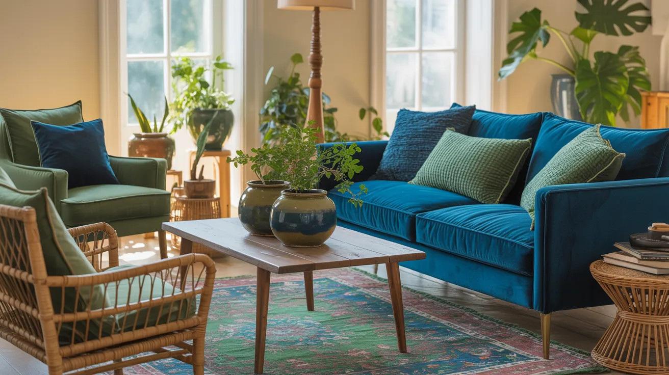
Teal Velvet Sofa
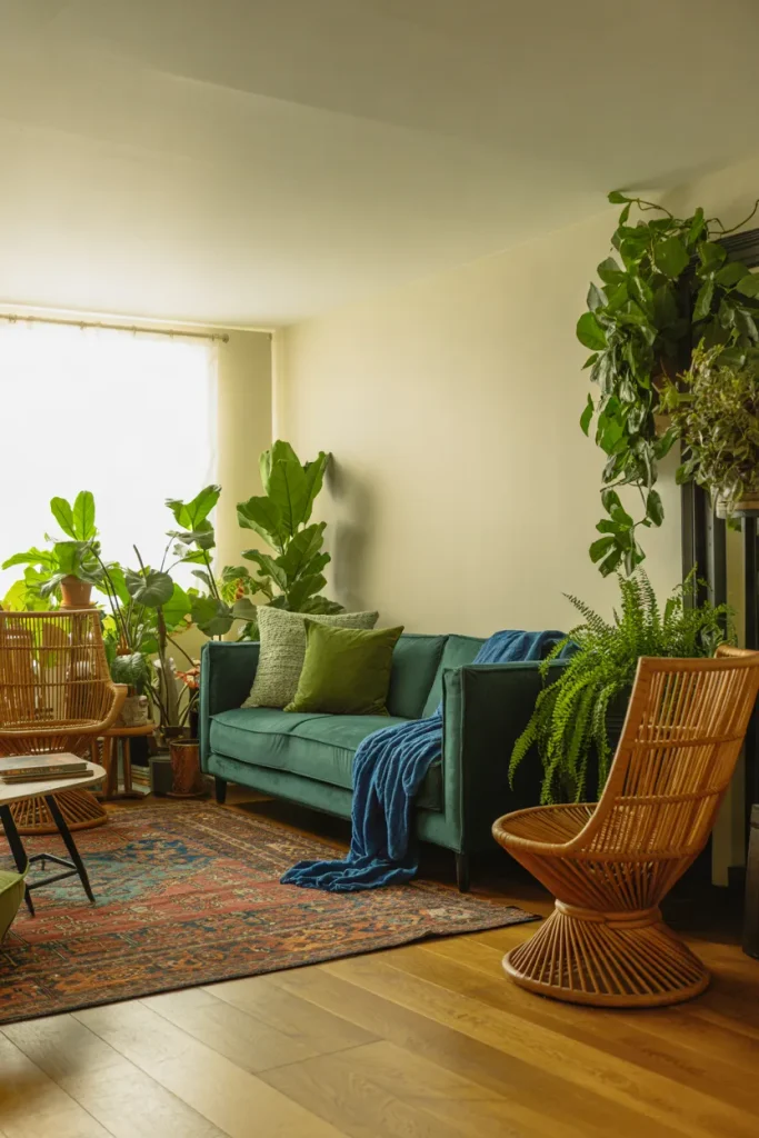
A teal velvet sofa instantly gives the room a strong visual anchor without making the palette feel too heavy. Pair it with sage, cobalt, and muted turquoise accents so the color story feels layered instead of matched. Natural wood and woven textures keep the richer shades grounded and relaxed.
In my experience, this works best when the largest furniture piece carries the deepest color and smaller accessories add variation. Use cream walls, a faded rug, and greenery to soften the contrast. The result is a blue and green boho living room that feels colorful and balanced without becoming overwhelming.
Vintage Blue Rug
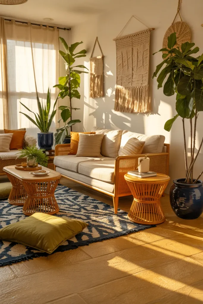
- Let the rug carry the busiest pattern in the room so other pieces can stay calmer and more flexible.
- Choose navy, denim blue, teal, or faded turquoise mixed with touches of olive or forest green.
- Leave several inches of visible flooring around the rug to keep a small living room from feeling crowded.
- Repeat one or two rug colors through cushions, pottery, or wall art to make the palette feel connected.
- Pair detailed patterns with simple wood, rattan, linen, or jute furniture for better visual balance.
A patterned rug helps separate strong colors from the rest of the room, so the space feels intentional rather than busy. I’ve noticed that slightly faded patterns are easier to layer with plants, pillows, and artwork. Keep nearby furniture simple, then repeat two rug colors in smaller accents for a connected look.
Layered Jewel Cushions
Quick Tip:
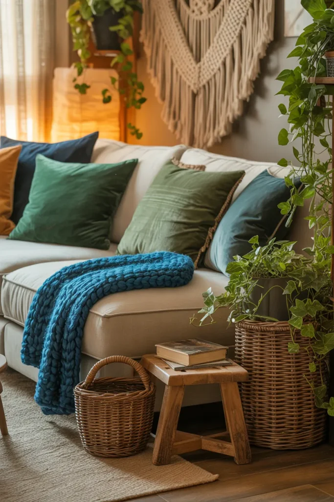
Start with three cushion colors rather than buying every blue and green shade you like. Choose one deep tone, one softer tone, and one patterned cushion that contains both colors, then vary the fabrics for a more natural bohemian look.
Cushions are one of the easiest ways to test stronger color combinations before committing to paint or furniture. Mix solids with small-scale prints, but keep one neutral sofa or chair underneath. That calmer base gives each shade room to stand out while the whole arrangement still feels relaxed and collected.
Emerald Accent Wall
BEFORE:
The room feels pleasant but flat, with pale walls and colorful accessories that seem disconnected. Blue and green accents are present, yet neither color has enough visual weight to define the space.
AFTER:
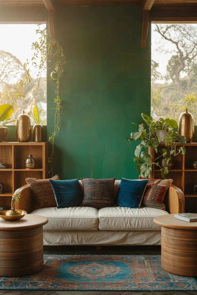
A single emerald wall creates depth and gives the furniture a stronger backdrop. Indigo textiles, plants, and warm wood now feel connected rather than scattered, while the remaining neutral walls keep the room open.
Deep green works especially well behind a sofa, reading chair, or media console because it creates a clear focal zone. Keep nearby blue accents slightly muted so they support rather than compete with the wall. Test paint samples in morning and evening light before choosing the final shade.
Blue Painted Cabinet
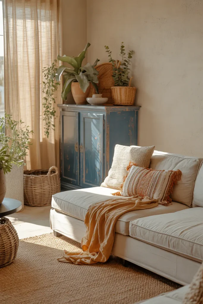
- Choose a secondhand cabinet, sideboard, or bookcase with simple lines and useful storage.
- Paint it dusty blue, muted cobalt, or deep denim rather than an extremely bright shade.
- Place green plants, natural baskets, and earthy ceramics around it to soften the painted finish.
- Repeat the cabinet color once or twice through a cushion, print, or small decorative object.
Painted storage brings color into the room without requiring a large decorating commitment. I’ve seen this work especially well in rentals where wall changes are limited. A blue cabinet against warm neutrals gives the eye a clear focal point, while greenery helps it blend naturally into a relaxed boho scheme.
Botanical Gallery Wall
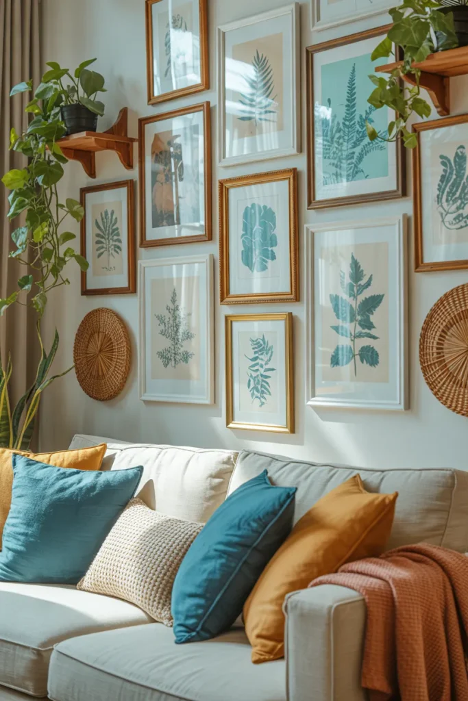
| Detail | Matching Frames | Mixed Frames |
|---|---|---|
| Overall look | Clean and orderly | Relaxed and collected |
| Best materials | Light wood or black | Wood, brass, rattan |
| Color balance | Artwork carries color | Frames add texture too |
| Best for | Smaller rooms | Eclectic boho spaces |
Botanical artwork brings green into the room without relying only on houseplants. Pair leafy prints with abstract blue pieces, then repeat similar shades through cushions or ceramics. For a more authentic boho feel, vary frame sizes but keep consistent spacing between pieces so the arrangement still looks deliberate rather than cluttered.
Olive Indigo Mix
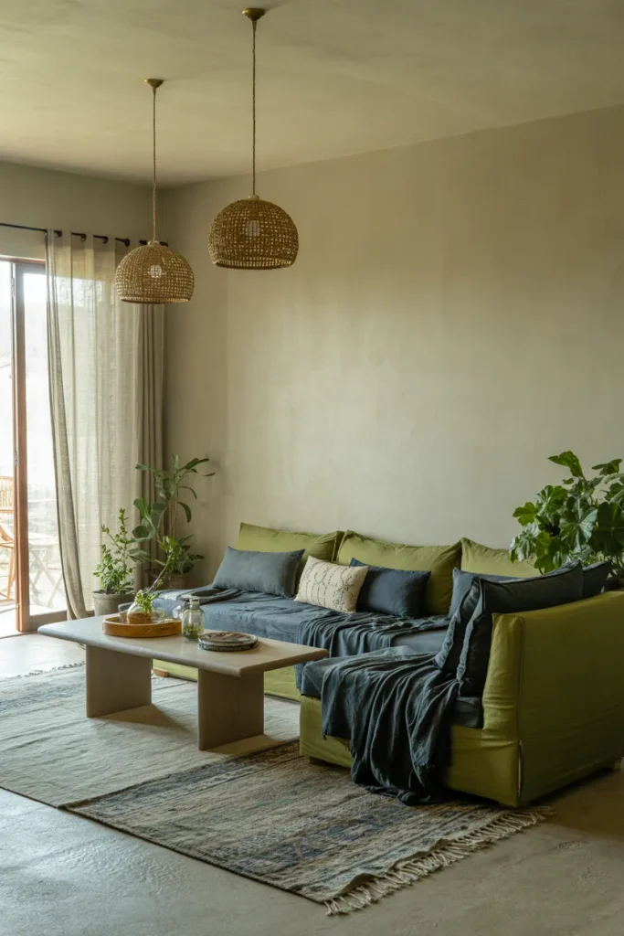
DO:
- Pair one olive tone with one indigo tone, then support them with warm neutrals.
- Repeat each color at least twice through textiles, art, or pottery.
- Keep larger furniture simple so the color pairing stays easy on the eyes.
- Add woven, wooden, and clay textures to stop the palette from feeling sharp.
DON’T:
- Don’t mix too many greens and blues with different undertones in one small area.
- Don’t place intense prints on every surface at once.
- Don’t skip lighter elements like cream, beige, or sand.
- Don’t let both colors compete equally in every corner.
Color balance matters more than quantity here. Let one shade lead and the other support it. I’ve noticed olive and indigo feel richest when softened by linen, jute, and aged wood. The room gains depth fast, but only if the contrast is spread evenly instead of stacked in one spot.
Statement Planters
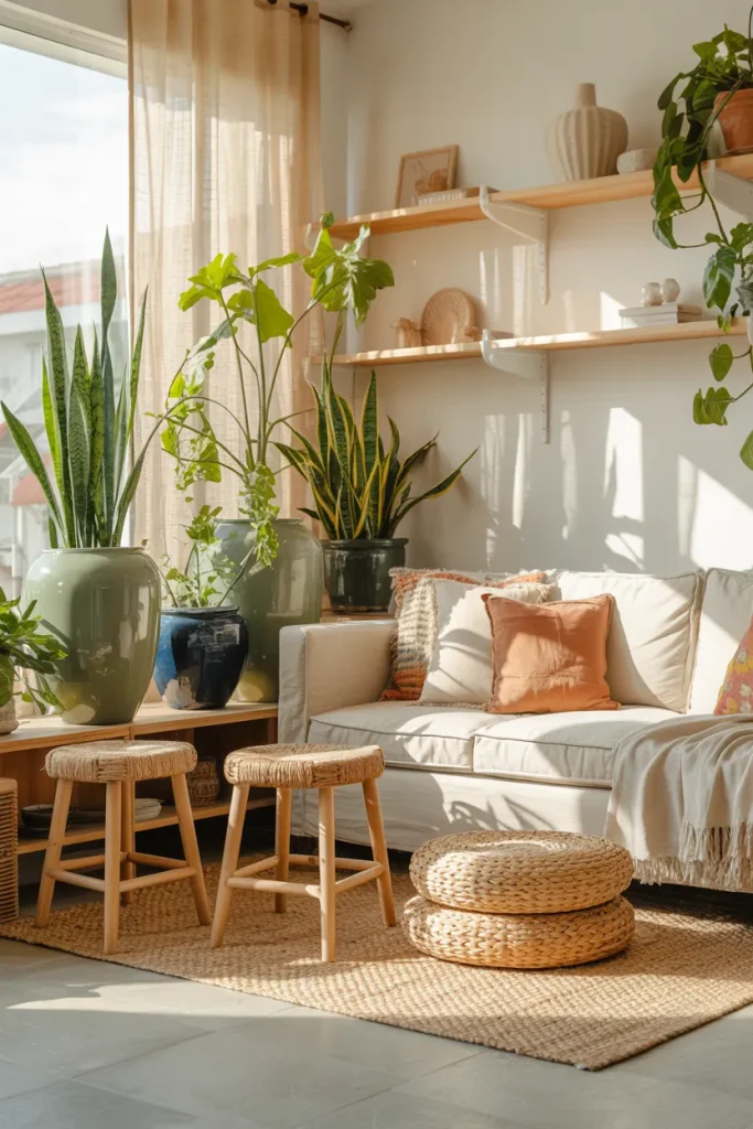
Cost: Low to medium, depending on planter size and material.
Time: About one afternoon to arrange and style.
Skill Level: Beginner friendly with instant visual payoff.
Best For: Renters, plant lovers, and rooms needing color without paint.
Small upgrades often carry the strongest visual impact. Group planters in twos or threes, mixing leaf shape, height, and pot color for a more layered effect. That’s why many experts recommend treating plants as decor pieces, not just greenery. Blue pottery and green foliage naturally echo the boho palette.
Sea Glass Curtains
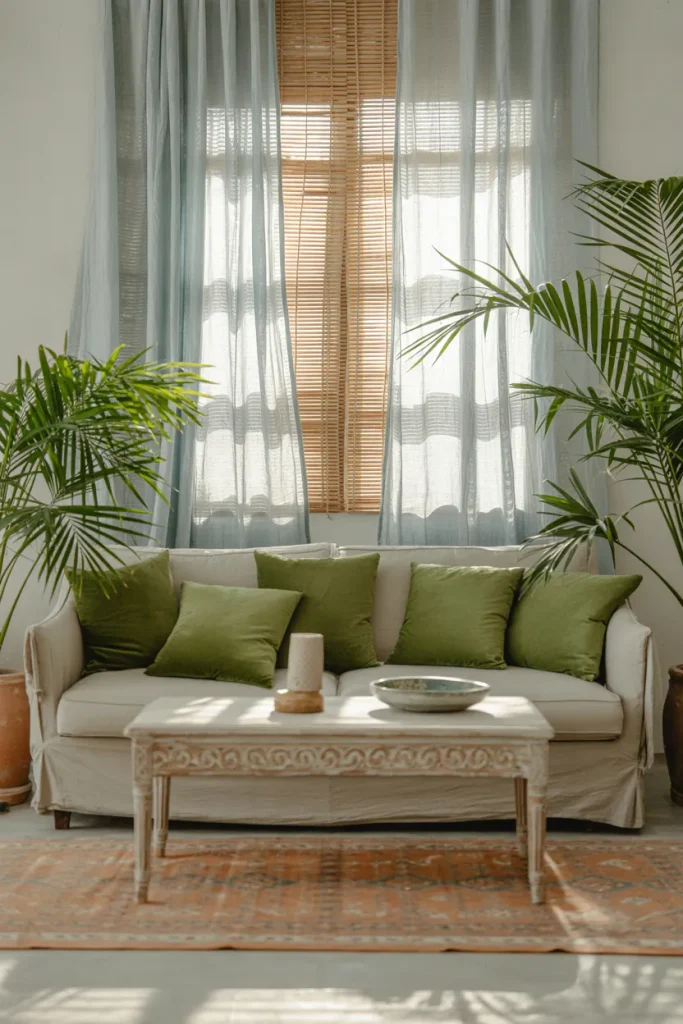
Curtains quietly shape the mood of a room, especially when the walls are neutral. Sea glass blue fabric adds softness without making the space feel dark, while nearby green accents keep the palette fresh. Choose light-filtering panels that move easily and fall just above the floor for a more relaxed finish.
In my experience, curtain color works best when it connects to at least two other elements in the room, such as cushions and planters. Stick with airy fabrics like linen blends or cotton. Heavier materials can make a casual boho setup feel too formal, especially in smaller living areas.
Turquoise Floor Cushions
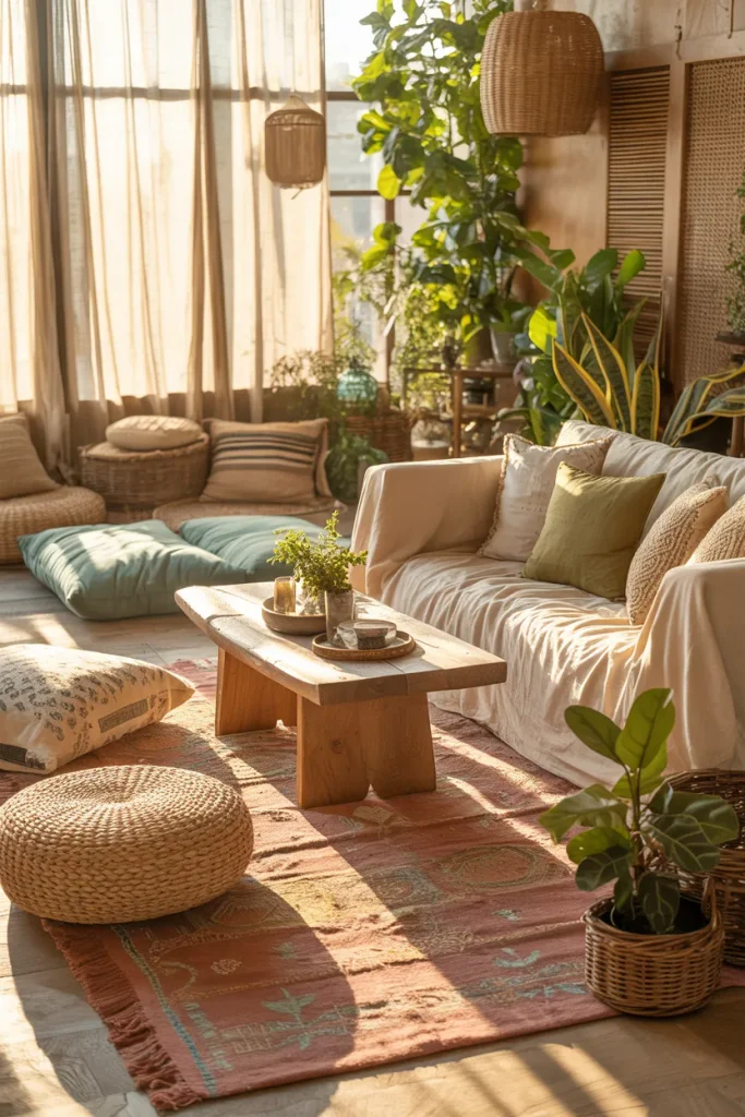
- Choose washable cotton or linen covers for easier everyday care.
- Mix solid turquoise cushions with one patterned design for visual variety.
- Place them near a low table to create an informal conversation area.
- Add sage or moss green pillows nearby to balance the brighter blue.
- Keep clear walking space around the floor seating so the room stays practical.
Floor cushions add flexible seating while strengthening the relaxed character of a blue and green boho living room. They work especially well in apartments where bulky chairs take up too much space. Choose firm inserts that hold their shape, then store extra cushions in a woven basket when you need more open floor area.
Sage Reading Corner
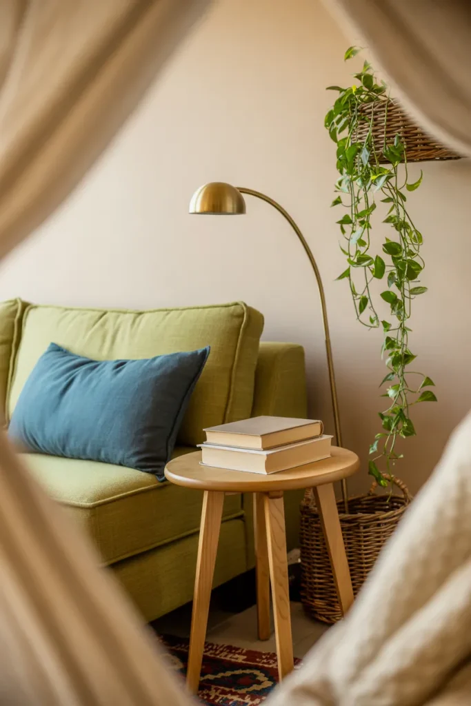
Quick Tip:
Give the reading corner its own small rug or floor lamp so it feels intentional rather than like leftover furniture. Keep the chair color soft, then use one darker blue accent for enough contrast without making the corner visually heavy.
A dedicated reading spot can bring color into an awkward corner that might otherwise stay empty. Sage is calming beside warm wood, while navy or cobalt adds definition. Place the chair close to natural light if possible, and keep the side table narrow enough that the area remains easy to move through.
Two Tone Shelving
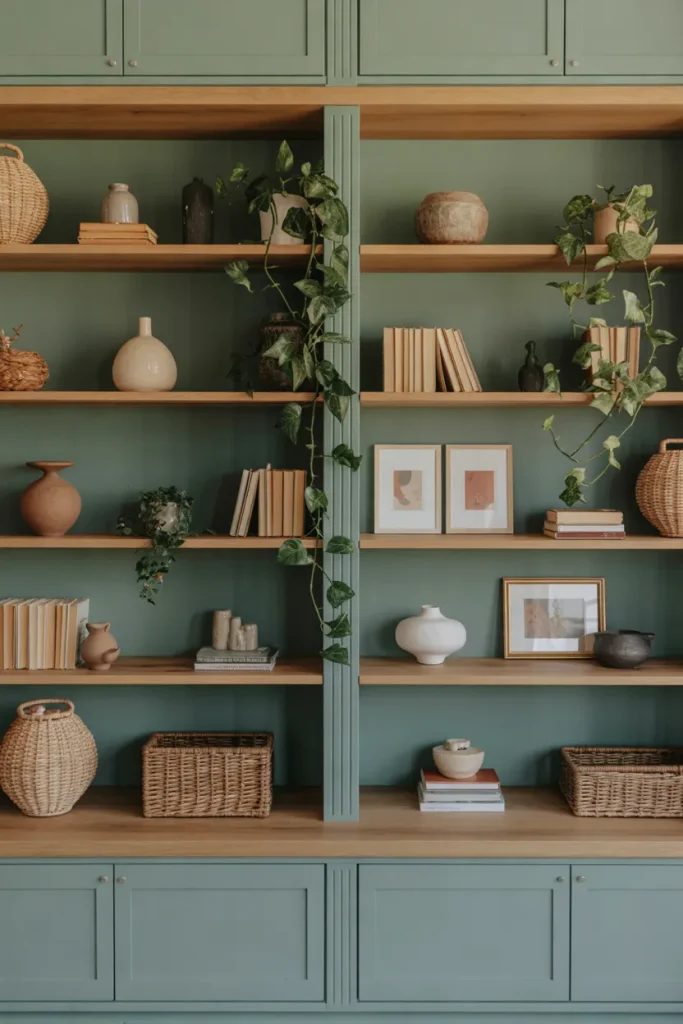
BEFORE:
Open shelves often become a mix of unrelated books, decor, and storage, making colorful rooms feel busier than intended. Plain shelving can also disappear against neutral walls without contributing much to the overall palette.
AFTER:
A controlled blue and green color treatment turns the shelves into part of the design. Coordinated ceramics, plants, and baskets feel more intentional, while the painted backdrop helps smaller objects stand out clearly.
Two tone shelving works best when one color is noticeably softer than the other. Keep the deeper shade inside the shelves and use the lighter tone around the frame, or reverse it for stronger contrast. Leave some empty space between objects so the colors and collected pieces have room to breathe.
Peacock Blue Chair
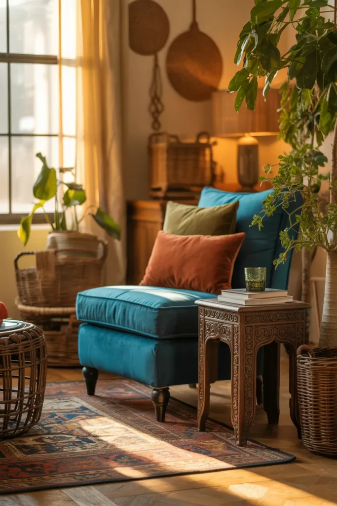
- Choose one sculptural chair in peacock, teal, or deep turquoise as the main color statement.
- Place it near a neutral sofa so the strong blue shade has room to stand out.
- Add one or two green accents nearby, such as an olive cushion or leafy plant.
- Ground the setup with wood, jute, rattan, or a faded patterned rug.
A colorful chair works especially well when replacing a plain seat you already planned to upgrade. Keep the surrounding accessories restrained so the chair remains the focal point. For smaller rooms, choose an open-legged design because visible floor space helps rich blue upholstery feel lighter and less bulky.
Green Patterned Wallpaper
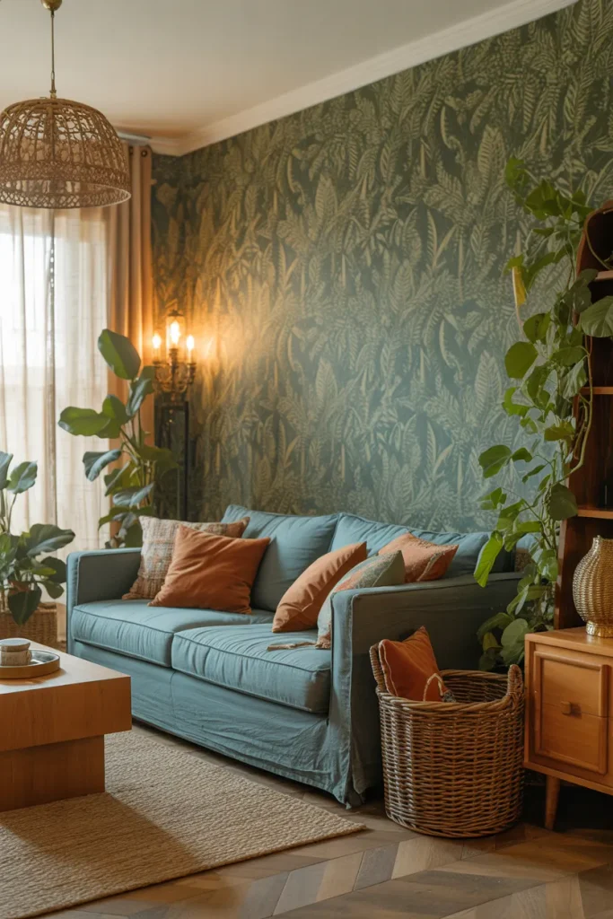
| Detail | Large Botanical Print | Small Leaf Print |
|---|---|---|
| Visual effect | Bold and dramatic | Soft and detailed |
| Best room size | Medium to large | Small to medium |
| Furniture pairing | Simple solid pieces | Light patterns or solids |
| Overall mood | Lush and expressive | Calm and layered |
Wallpaper can add pattern without filling every surface with decor. I’ve seen larger botanical prints work best when nearby furniture stays simple, while smaller patterns tolerate more layered textiles. Pick a design containing muted green rather than neon tones, then repeat one blue shade elsewhere to connect the wall with the room.
Cobalt Ceramic Accents
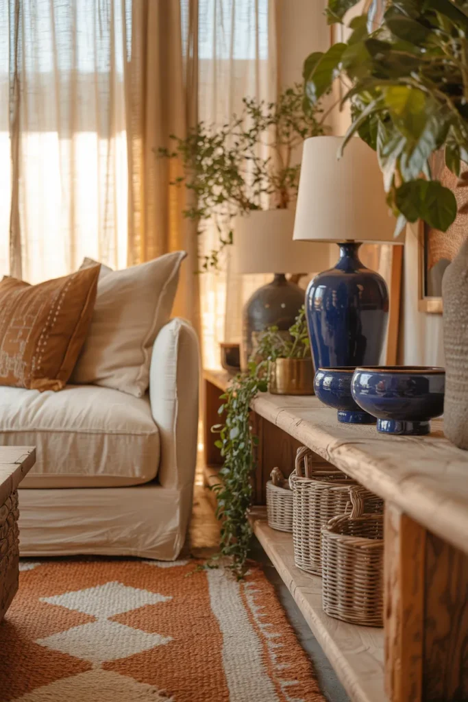
DO:
- Group ceramics in odd numbers for a more relaxed arrangement.
- Mix glossy cobalt pieces with matte or handmade finishes.
- Place blue pottery beside greenery to strengthen the color contrast.
- Vary object heights so shelves and tables feel naturally layered.
DON’T:
- Don’t scatter identical blue pieces across every surface.
- Don’t combine too many decorative objects on one small table.
- Don’t ignore scale when styling large shelves.
- Don’t use only glossy finishes if the room already feels polished.
Ceramics bring concentrated color without requiring permanent changes, which makes them useful for renters and frequent decorators. Choose fewer pieces with noticeable shape or texture rather than filling every shelf. A cobalt vase beside soft green foliage creates a strong focal detail, especially against cream, tan, or warm wood backgrounds.
Indigo Woven Throw
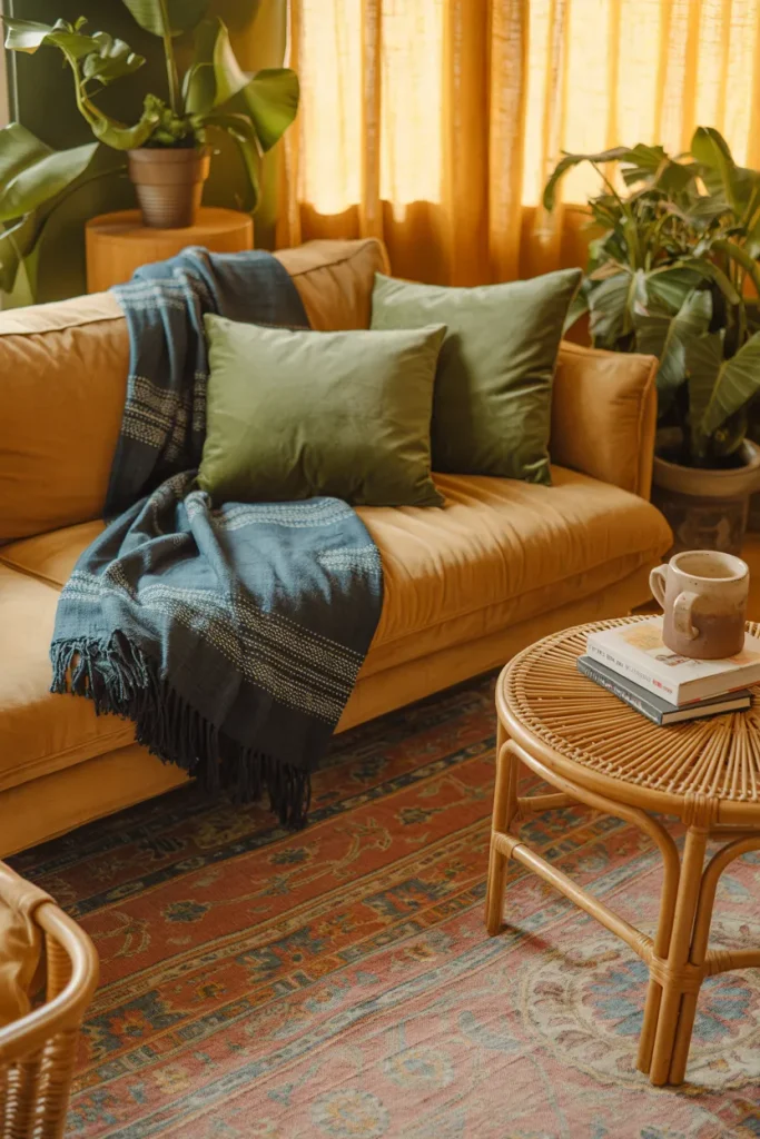
Cost: Low to medium, depending on weave and material.
Time: About ten minutes to style naturally.
Skill Level: Beginner friendly with no permanent changes.
Best For: Neutral sofas needing richer color and texture.
A textured indigo throw adds depth without covering the room in strong color. Fold it loosely over one sofa arm or let it fall across a basket for a casual finish. Choose cotton, wool, or chunky woven fabric, then repeat the blue once through art or pottery to create visual connection.
Moss Green Sofa
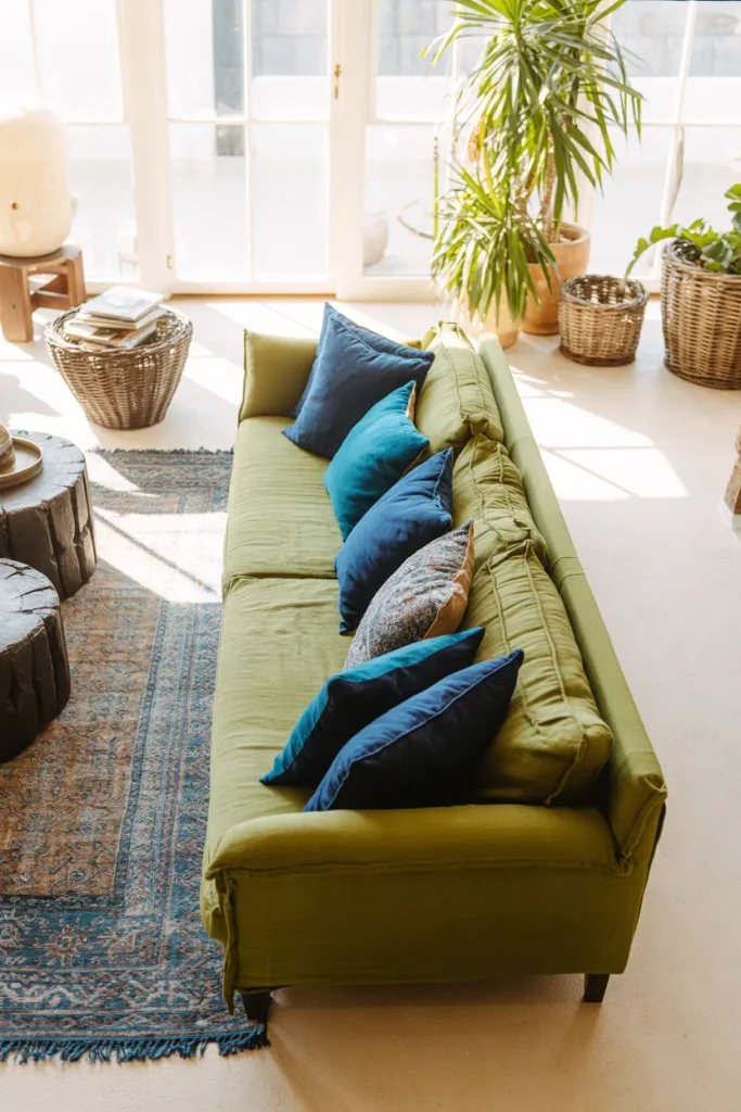
A moss green sofa gives the room a softer focal point than emerald while still bringing noticeable color. Pair it with navy, denim, or washed turquoise textiles rather than equally bright blues. Warm oak, cane, and jute help the two color families feel grounded and comfortable.
I’ve noticed moss works especially well in rooms with plenty of daylight because its earthy undertone changes gently throughout the day. Keep walls cream or warm white, then repeat green through plants instead of more upholstery. A faded blue rug underneath can tie everything together without making the seating area feel overly coordinated.
Blue Boho Poufs
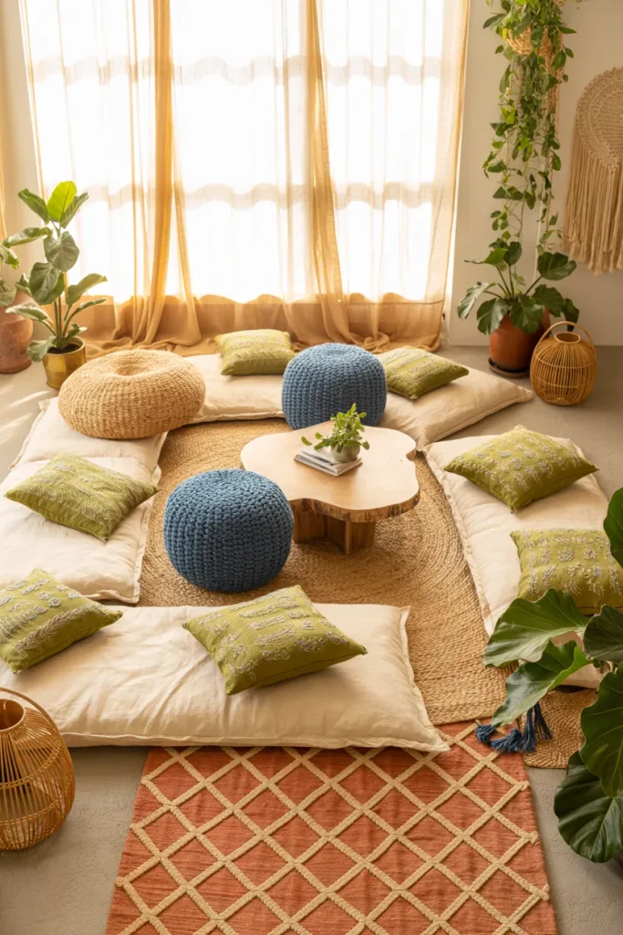
- Choose poufs in indigo, denim, or faded turquoise rather than identical bright shades.
- Place one beside the sofa and another near a reading chair for flexible seating.
- Look for woven cotton, kilim, or textured covers that suit a relaxed boho setting.
- Pair strong blue poufs with softer green cushions or plants to balance the color.
- Keep the floor around them open so the arrangement stays practical.
Poufs are useful because they add color, texture, and extra seating without taking up the visual weight of another chair. Choose firm fillings if they will double as footrests or side surfaces. In compact rooms, tuck one partly beneath a console or table when it is not being used.
Discover More: 24 Cozy Boho Living Room Ideas With a Grey Couch to Try
Sapphire Wall Art
Quick Tip:
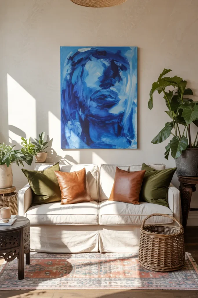
Choose one large artwork instead of several small pieces if the wall already has strong furniture or textiles nearby. Look for blue artwork with subtle green, cream, or earthy details so it connects naturally with the rest of the room.
Large-scale art gives the eye somewhere to rest while still reinforcing the color palette. Keep the frame simple, especially if the artwork contains bold patterns. I’ve noticed oversized pieces work particularly well above long sofas because they fill empty wall space without requiring several competing decorative elements.
Green Ceiling Detail
BEFORE:
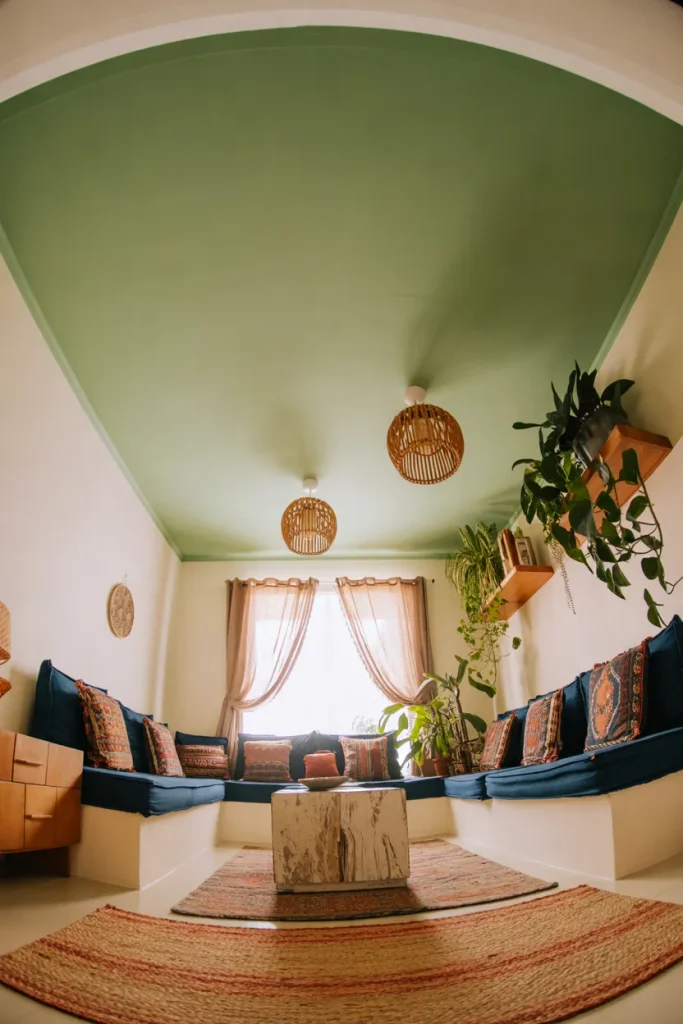
The room has blue and green accessories, but the upper half feels empty and disconnected from the decorated seating area. White walls and ceilings create brightness, yet the color story stops at eye level.
AFTER:
A soft green ceiling adds unexpected depth without taking over the room. Blue cushions, rugs, and pottery now feel more connected, while the lighter wall color keeps the overall space open and balanced.
Ceiling color works best when it is softer than the strongest shade used below. Sage, muted olive, or gray-green can add character without lowering the room visually. Test a large sample first, since ceiling paint often appears darker once it covers the full surface and reflects less direct light.
Layered Boho Lighting
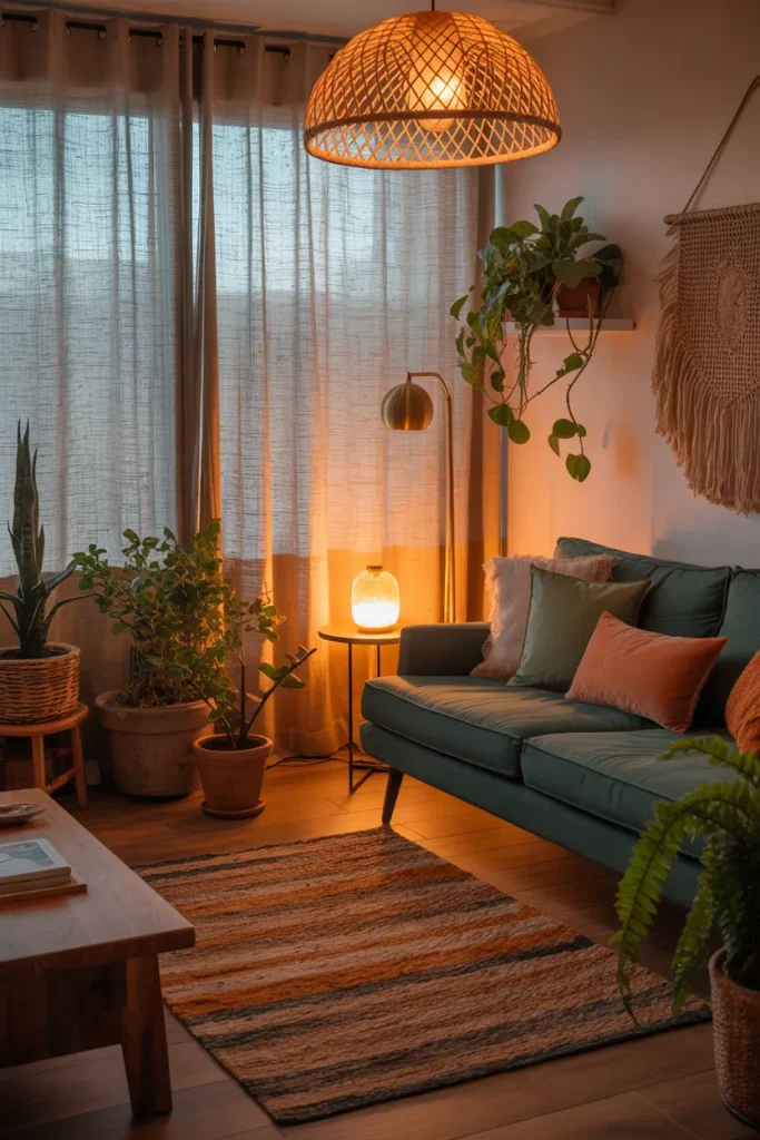
- Start with a woven pendant or ceiling fixture that spreads warm light across the entire seating area.
- Add a floor lamp beside the sofa or reading chair for focused evening light.
- Place a smaller ceramic lamp on a side table, choosing a blue or green base for subtle color repetition.
- Use warm white bulbs so saturated blues and greens stay soft rather than appearing cold.
Layered lighting changes how every color in the room appears after sunset. Warm bulbs deepen teal, indigo, olive, and sage while keeping natural materials inviting. Instead of relying on one bright ceiling light, spread illumination across several heights. The room will feel more relaxed, dimensional, and comfortable at night.
Conclusion
Creating a blue and green boho living room does not require changing everything at once. A colorful chair, patterned rug, painted cabinet, textured cushions, or a few ceramic accents can completely shift the mood of your space. I’ve noticed that the most inviting boho rooms usually grow gradually, with colors and textures added in layers rather than all at once.
Choose one or two ideas that fit your room and budget, then build from there. Save this post on Pinterest so you can return to your favorite inspiration, and share it with anyone planning a colorful home refresh. Start small, experiment confidently, and let your room develop its own personality.